Saica redesigns beer brand Loddon’s presentation packs
Corrugated group Saica Pack has helped boost sales for Loddon Brewery with a redesign of its presentation packs
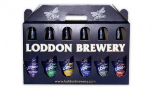
The group’s design team was tasked with developing new designs for the Oxfordshire brewery’s three- and six-bottle presentation packs.
In particular, the family business wanted Saica to produce packaging which more accurately represented the Loddon brand as a whole, and reflected its bottle labels that were redesigned last year.
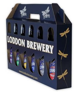
A statement on the project said that Saica’s team “took inspiration from the brand’s distinctive dragonfly logo” and also had to respond to a request from Loddon to ensure that the design “did not follow a standard template”.
The new packaging for the three and six bottle presentation packs uses the Loddon’s dragonfly logo as the main feature of design, which is reflected in both print and the physical structure of the packs.
Cut-outs in the fully corrugated ‘carry home’ pack highlight the logos on the main body of the bottle and the bottle neck, whilst quality printing using a gloss effect to finish off the high-end look of the design.
Luke Hearn, sales director at Loddon Brewery, said:“Since our new pack designs have been introduced, at shows, in shops and at other retailers, we have experienced an increased volume in sales which has led to the requirement for more orders.
“It was important to us that the structure of design incorporated our dragonfly our logo, helping to make it an integral part of our brand and providing the best possible exposure of this to our customers.”
Craig Allen, design engineer at Saica Pack, added: “Loddon came to us with a challenge to help them differentiate their product from others on the market. Thanks to our in-house design team, we were able to provide them will a fully customised service.”

