Purity’s Juiceburst new branding design
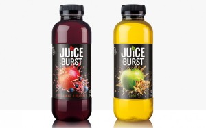 Purity Soft Drinks has undertaken a major update of its Juiceburst brand of drinks, with a new bottle design and more prominent logo enhancing the range’s promise of a full portion of fruit in every bottle.
The company has also revised the contents of the bottle, cutting the amount of added sugar by 20% across the range, equating to a 40% added-sugar reduction in three years after the changes it made in 2013.
following the changes made in 2013. At the same time, taste scores are improving as research from independent consumer panel tests show. No mean feat – and one that the business is proud to have achieved.
Juiceburst has seen growth of 20% in each of the last two years and latest figures suggest that the brand is proven to grow the juice and juice drink category, with retailers who stock the range seeing an average category growth of 22% against those that don’t.
Purity Soft Drinks CEO David Bell said: “We are not afraid to take risks and take on challenges, a great example being the Schools Approved range. We had just 12 weeks from idea to launch to get the product out there in the market. The industry needs change and we are helping to drive this. We have relaunched with what we believe is a better-for-you soft drink, whilst still delivering great taste to our key consumer.
“A key point of difference is our use of technology. Juiceburst is the world’s first digitally interactive soft drink brand – all packaging is interactive, meaning consumers can find out more about the product and play games using the Blippar app. This really appeals to our target audience, who are the generation of technology.
“Our aim is to cut the added-sugar by a further 10% come 2017 and we have just began to produce a multi-pack of our Schools Approved Juiceburst range for the lunchbox market. Around half of all school meals are taken as a packed lunch, so this represents a good opportunity for us and the retailers.”


