Pernod Ricard rolls out new look for Malibu
Malibu, the coconut-flavoured rum, has redesigned its iconic white bottle to give the brand a more contemporary look in a bid to appeal to a wider consumer audience
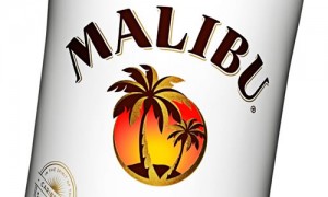
 The new design will roll out across all packaging formats as of March. In the new design, the logo, typography and bottle shape have all been evolved to deliver what Pernod Ricard call a “more distinctive, modern feel that emphasises the unique Malibu brand personality”.
The new bottle is more slender with high shoulders and the logo is intended to evoke what its maker called the “free and easy spirit” of the brand.
The addition of a clear window around the bottom of the bottle maximises shelf-appeal.
Patrick Venning, marketing director at Pernod Ricard UK, said: “Malibu is an icon of the drinks industry and we are confident that the new look will continue to ensure the brand has maximum stand-out on a busy retail shelf or back-bar.”


