P.E.T. Engineering Case Study: Vitasnella
 The project:
Vitasnella water brand was acquired by Ferrarelle in 2012 and entered the market with a packaging that, although well established in the Italian consumers’ mind, was misaligned if compared to the dynamic, modern, and glamorous advertising campaigns of recent years.
Though enjoying widespread appreciation, Ferrarelle decided to update Vitasnella’s image through a restyling able to transmit, through more up-to-date aesthetic and iconographic codes, not only the brand’s promise but also the improved performances and ergonomics of the packaging. They needed to show how the product is consistent with the consumers’ perception of quality, that is to say men and women who love wellness and sport activities.
The solution:
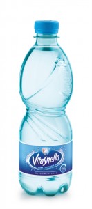
The restyling, entrusted to the design center of P.E.T. Engineering, appealed to the benefits of the brand’s promise, which is the feeling of being fit, translated into a container with a tapered and harmonious shape. This ideal shape was obtained by modifying the proportions of the upper and lower parts of the bottle.
The product’s light and airy nature is visually represented by removing the complex decoration of the previous version and inserting a graphic garnish, which starts from the shoulder and flows sinuously along the body symbolizing how water enters the body and the elimination of excess fluids and toxins.
The graphic ornament, apart from being a meaningful element, becomes structural and strengthens the grip area, which was developed according to ergonomic and anthropometric factors, making the packaging the perfect tool for a physical activity practiced by all: drinking Vitasnella water.
“The new bottle shape is both manageable and practical, characteristics that are essential for our the target customer, women and also men between 25 and 45 who have an active life and play sports regularly – affirms Gabriele Monda, Brand Manager of Vitasnella. The light-weight design of the bottle, and more precisely the modification of its handling, makes the bottle more ergonomic and easier to use. This innovation is very relevant because now the brand Vitasnella can highlight its positioning, not only through the activities above and below-the-line already explained, but also through its packaging”.
This project has been a restyling that expresses the brand’s promise by creating a strong synergy between packaging and communication.


