Options Indulgence | Shelf Review
Every month, Monica Lucas, president and research director of retail consultancy Pragma, takes a look at a recently-launched pack from the consumer’s point of view. This month: Options Indulgence
Background
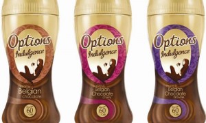
Options is a leading instant hot chocolate brand and the Options Indulgence range is an alternative featuring Belgian chocolate.
The packaging had previously used dark brown graphics emphasising the Belgian chocolate taste. The new packaging is aimed to “allow for the enhancement of taste credentials for the Options Indulgence range”.
Graphics 7/10
The previous dark colours did not convey healthiness well at all, and overemphasised the ‘chocolateness’, making it look a heavy thick drink.
The new lighter tones succeed in giving the brand a healthier look, more of an everyday drink and less of a special occasion indulgence. The image of the lady relaxing in the Options ‘O’ further emphasises the relaxing nature of the drink. However, the greater use of gold also conveys a more premium product, and the colour accents serve well to differentiate the variants.
On shelf 6/10
The packaging does not stand out very strongly in this crowded market, and looks perhaps a little downmarket compared to brands like Green & Black, and similar to Galaxy Instant, although more sophisticated compared to its former incarnation. Our concern is that it is in danger of being caught in the dangerous middle: between the market leader Cadburys, and more upmarket brands such as Whittard.
Overall 6/10
The new packaging succeeds in creating a wider appeal, and it emphasises its healthiness and everyday appeal, but we have a concern it neither appeals to those wanting a treat, who may prefer more upmarket brands, and those opting for the market leader.


