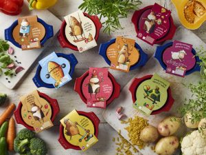
New packaging design for Little Dish by Pearlfisher
 Pearlfisher creates the future of healthy food for kids with their new portfolio architecture and structural packaging design for Little Dish.
In 2006, Pearlfisher created the first ready-meal brand designed specifically for toddlers and children. Ten years on, Little Dish had become the icon of the children’s ready meal category, but as an increasing number of brands followed in their footsteps, the original pioneers needed to rewrite the rules and set a new standard of health once again.
Having worked in partnership with nutritionist and Mum, Lucy Jones, to create a new range of nutritionally balanced pots and pies, Little Dish turned to Pearlfisher to develop a vision, voice and series of packaging structures that would bring the nutritional credentials of the new meals to the fore.
Jack Hart, Strategy Business Director at Pearlfisher, said, “The challenge we faced was to better connect parents to the brand’s mission of “feeding healthy kids” by showcasing how healthy Little Dish meals are as fresh and convenient alternatives to the processed trays and pouches available in the children’s aisle. We needed to reframe the consumer relationship with the brand
and, as such, established a set of segmentation principles from which we created a reassuringly eclectic mix of products that felt homely, authentic and diverse but still held together as a range.”
Taking inspiration from colourfully-enamelled cookware and the kitchen cupboard, Pearlfisher Strategy defined creative principles for Little Dish across six key equities: colour, texture, labelling, graphics, the role of form and the already appropriated family of “zoo crew” characters.
Using this and deep immersions into Little Dish’s food preparation and packaging processes as blueprints for design, Pearlfisher’s 3D and graphic teams reintroduced cohesion and visual excitement to the range, managing to maintain the specialness of the Little Dish brand while establishing cues around quality, wholesomeness and health.
Mike Beauchamp, 3D Design Director at Pearlfisher, said, “We used form, colour and material finish to hero the new Little Dish brand experience. The ‘pot’ and ‘pie’ containers are a first of their kind, with bespoke shape, colour, surfacing and embossed detailing on unique handles to communicate the brand’s premium quality and drive ultimate differentiation on shelf. We used the card sleeve to talk to both parents and kids: a deli-style sticker on the side of pack helps parents navigate stacked meals on-shelf, leaving the entire top face for kids to see Charlie the Chicken skipping with a spaghetti string or Lucy the Lamb lifting meatball dumbbells. Graphically, we assigned bold colours to different protein sources to help with product identification and used handwriting cues to emphasise the youthful naiveté of the brand.
Little Dish co-founder Hillary said of the redesign, “The Little Dish brand was born in the Pearlfisher building and thus, they were the only partners we trusted to help us take our brand into the future. What they have done is category-defining – capturing the spirit of Little Dish whilst repositioning our offering for health-conscious parents. It was a fantastic working relationship and the fact that our Chief Tasters Monty and Ridley – my two boys – can’t get enough of the new designs is a sure-fire sign of a job well done.”


