McDonald’s presents its new global packaging design
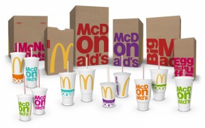 The fast-food giant, McDonald’s is unveiling new design for its paper carry-out bags, fountain beverage cups and sandwich boxes this month. The new packaging is designed in collaboration with branding agency Boxer.
The new look is characterised by irregular lettering and bright colours, with the fast food chain’s iconic golden arches extending beyond the front of the paper bags to the side panel. The bold new look also places the company’s I’m Lovin’ It tagline against the edge of the front panel of the bags, in a red tab.
The rollout of the updated design will begin in the UK before being extended to incorporate the UK and Europe, with more than 36,000 restaurant adopting the new packaging during the course of this year.
“It’s hard to say who gets the credit for the actual design because everyone had a hand in shaping the thinking,” McDonald’s senior director – global brand development Matt Biespiel told Ad Age magazine.
The design is the result of collaboration between seven of McDonald’s partner agencies, before it was then developed and finalised by UK-based Boxer. The creative agency was also part of McDonald’s previous packaging overhaul in 2013.


