McCain Rebrand
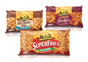
BrandOpus has undertaken a major overhaul of the frozen food brand McCain. The redesign sees the introduction of a new logo for the first time in over 50 years.
The new identity evokes a natural landscape and anchors the logo in sunshine, which brings warmth to the McCain brand. The design also sees the removal of the ‘black box’ logo, fundamentally reframing the brand.
The new visual identity, as well as a redefined brand architecture, typographic style, and colour logic helps to segment, signpost and simplify the McCain product range. The result improves shelf standout in crowded frozen fixtures.
The new brand identity was implemented through the Melbourne studio of strategic design agency BrandOpus, and is part of McCain’s strategy to drive brand and category growth within the Australian market. BrandOpus worked closely with the local market to balance recognition of the key products and ensure ease of consumer navigation around the rationalised portfolio, through the new masterbrand identity.
Paul Taylor, Executive Creative Director at BrandOpus says of the design, “We were challenged by McCain to imbue their brand identity with new meaning. Establishing the sunshine as the new symbol for the brand reflects the warmth & positivity of a natural world that will ensure the consumer reappraises the role of the brand.”
The new design is appearing in stores now.

