Maximizing the Sale: Keys to Effective Packaging Design (Part 2)
Written by Jenn David Connolly , Founder and Creative Director, Jenn David Design.
You’ve got their attention. Your package stood out from the rest in their eye. Now that you’ve got their attention, how do you engage them to pick up the product? Let’s take a look at what happens next in the sale process and how you can optimize your package to maximize the sale. This is the second in our series on creating packaging that increases sales. (See Part 1 here)
We touched on copy in the first part of this series, but here’s where that really comes into play. Now the consumer is interested in learning more and they may be thinking, “ I like the look of this product and I sense that it’s unique, but why should I buy it? Why is it better than the other choices here? What are the benefits? Is it worth the price? Does the quality meet my expectations?” These are all the questions that are flying around the consumer’s head in just a couple seconds, consciously or unconsciously, and they are looking to the package to provide the answers. The better job the package does of informing, the more likely the consumer is to buy.
Less is more.
Don’t try to cram too much information on the PDP (principal display panel). It’s tempting but it’s one of the biggest mistakes a package can make. Remember the consumer is not likely to take the time to pore over every single word on the entire package. In fact, it’s helpful to imagine the scene in the store: they’re strapped for time, they may be answering a text, and young children may be crying while sitting in the shopping cart. You can help your customer focus on their purchase decision by supplying only the most important information on the front of the package.
Make it easy to find information.
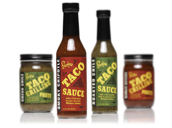
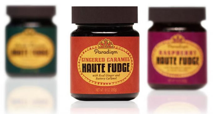
The hierarchy of information makes it easy for the eye to find the most important information first. Typically, information is places like this:
1. Title: Name of product
2. Product descriptor: Flavor, variety etc.
3. Callouts: Only the most important, differentiating quick facts
4. Branding: logo, company name
5. Romance copy: This short copy elaborates on what the product is, what it does, how they can use it
6. Size: net weight/fluid ounce
If any of the above gets muddled or is hard to find, they may quickly move on.
Title: It’s all in a name.
It’s true. Product names can significantly contribute to the success of a product. As we mentioned in the previous post, funky names can be fun and memorable, but sometimes it’s best to just call it what it is. It’s a fine line, sometimes if you try to get funky with the name in can be confusing to the consumer. So if you dare to be different make sure you know what you’re doing. Conversely, playing it safe can be equally dangerous. Just be sure you aren’t obfuscating what the product is or making it blend in with its competitors. In short, always know your target audience.
Descriptor: Don’t make them have to think.
Here’s where you differentiate among the different products in your line. Color often creates a strong visual cue so you don’t have to rely on words alone. Color can work in two ways:
1) It makes it easy for the consumer to visually differentiate without having to actually read the words. Little to no effort is required on their part to tell one variety from another in the line.
2) It reinforces the descriptor. For example, strawberry flavor is pink or red because that’s the color of strawberries. To the eye and the mind it makes sense again without the consumer having to put much effort into it.
You also want to keep in mind certain color/flavor conventions that may not be literal but are common standards—vanilla being denoted by the color blue.
Callouts: Why you should buy.
This is where you tell your customers any specific factors they may be looking for: all-natural, organic, gluten-free, no sugar, non-GMO, etc. Again it comes down to knowing your target audience and what’s most important to them. Are you a company that understands them and knows what they want? Let them know.
Consider using any qualifying logos such as USDA Organic Certification, Non-GMO Project etc, but make sure your products have gone through the correct approval in order earn the right to use those logos. Additionally, if your product has won any prestigious awards, considering featuring the award logo as well. You certainly don’t want to overwhelm your PDP with third-party logos unless you have ample space and it makes sense, so pick and choose what’s most important to your audience and save the rest for text and/or secondary panels.
Be careful not to overwhelm with callouts as they can start to look busy quickly. Consider using the romance space for the callouts instead.
Branding: It’s not first.
Resist the urge to make the branding first in the hierarchy. The typical shopper has a need or desire for a certain product and most likely doesn’t know your product exists. So they are not shopping by looking for your brand, they are looking for a product to fill their need. Hence, the product title should be the most prominent information on the PDP. If done right, the branding is conveyed through the overall look and feel of the package in addition to having the logo be present and noticeable on each package, yet subordinate to the title and descriptor.
Romance: It can’t be novel length.
Your package may not have room for romance on the front, but if you do, it’s always a good idea to include at least a few words to elaborate on why it’s different and better or a few tips on how to use the product. You don’t have to use full sentences; save the full verbiage for secondary panels.
Remember, you know your product inside and out. Your potential customers do not. So be sure to include romance copy to sway your customer. Depending on the specifics of your package, you may choose to use the romance space on the front for the callouts, in which case the callouts act as the romance. You may also choose to put romance on a secondary panel. For example, if your package is small and has a panel just left of the PDP, that could be a good place to put romance. If your package has only front and back display panels and you leave the only romance for the back panel, then it’s competing with all the other required information such as nutrition facts, ingredients, company information and runs the risk of receiving scattered attention.
You will still want to have romance on the back or secondary panel even if on the front, more on that later on in this series.
Size: Size does matter.
The FDA regulations require that the characters in the size declaration must be at least 1/8″ tall. On smaller labels, that can often be a challenge to fit in and make it look good. However if your product is a better value than others in its category, if the consumer is getting more product for a comparable price point, and if you have the room on the package, consider making the net weight or fluid ounce declaration bigger than the standard. After all, you want to inform the consumer that they are getting a better deal when they buy your product, which can often be a strong deciding factor. Even if emphasized, it will still probably be the least prominent information on the PDP.
Overall design: It needs to work together.
You could be following all the right steps technically but you still need to consider the overall package and how these elements all work together to create a successful package. It takes skill to make all these different elements and the design elements work together to give the consumer’s eye just what it needs at the right time. Remember, a package that does a good job of informing is more likely to build trust in the consumer and is therefore more likely to sell.
Next in the series we look at the next step in the process: how to convert the sale.

