BrandOpus creates new look for Twinings
BrandOpus has given a new look to tea giant Twinings’ Everyday range
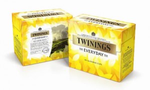
 The recognisable yellow background has been developed to feature a tealeaf pattern and bright glow.
Design agency BrandOpus said that the yellow ensures clear recognition for existing customers and provides a “more distinctive visual equity for the range”.
In a statement, the firm said: “Superfluous product imagery and messaging has been dispensed with to achieve a more single minded and modern design that creates greater simplicity and stand out for the Twinings everyday blend.”
Simplifying the design
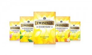
 The redesign comes after the news that the Twinings range has been extended to include four new ‘everyday extra’ blends.
BrandOpus said that it was keen to create significant shelf blocking and standout for the entire range by ensuring that they utilised only the elements established in the core design to act as blend differentiation.
Paul Taylor, executive creative director at BrandOpus, said: “We had to assess the previous design and challenge what was absolutely necessary to take forward. Only when we were able to simplify the design could we create a confident pack that will sit proudly alongside its competitors and the wider Twinings portfolio.”


