Premier Foods Unveils New Look For Sharwoods

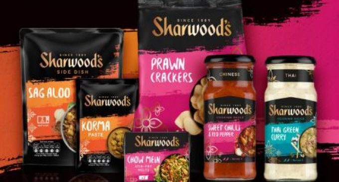
Premier Foods has revealed the new packaging design for the UK’s number one brand in Asian cuisine – Sharwoods – hitting the shelves this month in the UK and internationally. The vibrant design has been developed by award-winning branding consultancy, Coley Porter Bell.
Charged with increasing stand-out and helping consumers engage with the brand better, the agency used Visual Planning to identify an opportunity to take consumers on a culinary and sensorial journey with Sharwoods. Coley Porter Bell also developed a clear brand architecture helping navigation and allowing flexibility to accommodate future new product developments.
The new pack design features free brushstrokes comprised of vivid colours with the product’s name written in a free-form font giving a sense of adventure, modernity and impact on the shelf. Each of the ranges, Indian, Chinese and Thai is enveloped in a rich palette and symbols that are associated with the corresponding country.
James Ramsden, Executive Creative Director at Coley Porter Bell, comments:“Cooking sauces is a much more commoditized category than it used to be. For Sharwood’s, we had to elevate the brand to give consumers more of an experience – we wanted to bring to life the confidence and delicious sensations of cooking these foods.”
Yilmaz Erceyes, Category Marketing Director, Savoury Meals at Premier Foods, adds: “The magic ingredient CPB has is the unique way it approaches briefing, which is its Visual Planning™ workshop. This is where we create the design brief as a client and agency team together not with words but with images. I am convinced this was the key enabler for us to land on a brilliant new brand design for Sharwood’s that tested outstandingly well with consumers, significantly outperforming the previous design as well as the competitive set. I’m convinced this will be a key business driver for us in the new year.”


