Pearlfisher Redesigns the Ben & Jerry’s Portfolio

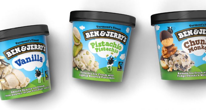
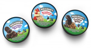
Pearlfisher New York has created the new global packaging and architecture for ice cream icon, Ben & Jerry’s. Ben & Jerry’s is an undisputed icon in the ice cream category, known for their whimsical flavour combinations and their social and environmental consciousness. Pearlfisher’s challenge was a global redesign to revamp the Ben & Jerry’s packaging portfolio, elevating the premium quality of the product depiction and refining the architecture without abandoning the principles that are at the heart of the brand. Pearlfisher’s new design has created an elevated offer for the brand, allowing it to continue its iconic growth on a global scale with increased clarity.
Pearlfisher has refined the brand’s visual identity on shelf, making it more coherent across all territories and elevated several of Ben & Jerry’s core brand equities – a blue sky with clouds and green pasture – that were being overshadowed by increasingly complex and layered flavour combinations. To address Ben & Jerry’s most prominent brand equity, their complex flavour combinations, Pearlfisher created an ownable visual language using the flavour tower.
 Hamish Campbell, Pearlfisher Creative Director, comments: “Consumers already love Ben & Jerry’s indulgent flavours and the brand’s effusive personality. Our job was to take that personality and use it to express how premium the product is. The flavour towers play with gravity and scale, creating indulgent larger than life taste expressions. The iconic Ben & Jerry’s cow frees the brand to convey the spirit, joy and whimsical nature of Ben & Jerry’s. We used both tools to clarify the brand’s messaging, unifying the brand and creating a more consistent and premium feel across all segments.”
Mike Branson, Pearlfisher founder and Chief Executive Officer, comments: “Premium quality and quirky personality are often considered conflicting equities – we are pleased that our redesign has proved that it’s possible to create utterly ownable and distinctive personality without compromising euphoric taste communication. Add to this global brand desirability and we are incredibly optimistic about this new design for Ben & Jerry’s.”


