Healthy options | Cover Feature – food and health
Food packs are set to change in 2013 with new standard traffic light labelling. Simon Creasey finds that clever graphics and structural design are also crucial to encouraging healthy eating
 Pop into your local supermarket and pick up a packet of own label chocolate digestive biscuits. Now carefully inspect the packaging. Across the front and back of the pack you’ll find a raft of information that goes beyond brand messaging. There might be a logo saying that it’s free from nuts, gluten or suitable for vegetarians. Then there’s all of the nutritional information to pore over, such as the fat, sugar, salt and calorie content of a single serving. And we mustn’t forget the recycling details.
The amount of information on such a small surface is mind blowing so it’s little wonder to hear that it leaves consumers bewildered. A global online survey of more than 25,000 consumers conducted by market research firm Nielsen last year, found that more than half admitted difficulty deciphering information on food labels. The issue is complicated further by the fact that at a rival supermarket, the same size pack of own label chocolate digestive biscuits would present the information in a completely different way.
This confusion is part of the reason why the UK government unveiled plans in October 2012 to introduce a new front-of-pack ‘traffic light’ labelling system. The new system, details of which are expected to be unveiled by the Department of Health in the first quarter of this year, is expected to be a hybrid of traffic lights and guideline daily amounts (GDAs), with universal adoption by suppliers and retailers possible as early as the summer.
With everyone finally singing from the same hymn sheet it will make life easier for consumers and guide them towards buying healthier options. But this move in its own right isn’t going to be a panacea for the nation’s obesity problem, which is fast becoming an epidemic. So what are food packaging designers and manufacturers doing to help consumers make the UK a healthier nation?
Both graphics and structure play a role, with brands big and small such as Heinz, Good4U, Waitrose’s Love Life and many more coming up with beautiful and innovative packs to help push consumers towards healthy choices. On nutrition labelling, in recent years a number of retailers and suppliers have dabbled with their own schemes. Yet a lack of a unified approach has only served to exacerbate the issue, argues Andrew Lawrence, creative director at design agency Elmwood.
“We’ve seen a raft of different solutions over the last 10 years and there has always been a shroud of confusion surrounding them,” he explains. “Guideline Daily Amounts left us all confused and only after the Food Standards Agency pushed for traffic lights a few years ago was simplicity on the horizon. Private label has taken up the baton and their use now forms a big part of most retailers’ pack guidelines. However, it is harder for brands to live with the attention that too many red dots bring, which is probably why some of the big brand players have steered well clear.”
‘Natural beauty’
In addition to the big household brands looking to avoid sticking red warning lights on their products, there has also been a problem around the culture of designing food packaging, believes Darren Foley, managing director at Pearlfisher.
“Firstly, food and drink brands have, and in many cases still do, glorify the processed nature of food,” says Foley. “Rather than hero our food and its natural beauty, design and its technology has often created barriers and misrepresentation, making even natural food brands look synthetic and fake.”
While some brands may have failed to educate consumers about the benefits of healthy eating, the packaging industry has worked hard to come up with some innovative solutions to the growing obesity problem, particularly around the issue of portion control. One of the most popular solutions, which has seen major growth in recent years, has been the addition of resealable stickers to packs to ensure that the product is not eaten in one sitting.
“We’ve had a lot of interest from companies looking to build in resealability and functionality so that you enable portion control through the pack,” says Simon Wildash, head of marketing at tear tape and label manufacturer Payne Worldwide. “For example you can put resealable labels or tapes or add ziplocks so that the pack can be used as a functional store.”
Although significant inroads have been made in this area, with resealable labels added to a wide range of different products – from pasta through to sharing bags of confectionery – Cathy Barnes, professor of retail innovation and director of the Faraday Centre for Retail Excellence at Leeds Metropolitan University, feels that a lot of these resealable solutions lack functionality.
“As a visual cue they’re brilliant and I think the insight is really good, but because they’re trying to do this for a minimum cost a lot of the time the execution is poor,” she says. “I think that’s where packaging lets itself down a lot of the time because the industry has some really good ideas. However, because of manufacturing constraints, or cost constraints, or supplier agreement constraints, the execution doesn’t live up to the concept.”
Easy design wins
Unfortunately, the harsh commercial realities of a world still struggling to haul itself out of a double dip recession will inevitably restrict what the industry can do, but there are some cheap easy wins in the area of packaging design, according to Greg Vallance, managing partner of creative at Holmes & Marchant.
“The look and feel of the pack can give health and natural cues, including muted colour palette, typography and imagery of the product,” explains Vallance. “McDonalds is a case in point and has pushed a healthier message through changing its shop fronts and interiors from the vivid and unhealthy looking red and yellow to a muted, more natural, dark green.”
A wider use of colours such as white, green and earthy tones, have already successfully been employed to convey the message that the product inside the pack is better for consumers’ health. But there are a number of other visual cues that designers can use, according to Joe Schurtz, executive vice president at PRS Research.
“Iconography can serve as an ‘on sight’ way of depicting an active lifestyle, the benefits of healthy living or creating a link to a specific health-related message – low salt, less fat, the presence of omegas and so on,” he explains. “Design ‘violators’, which succinctly call out reduced fat, low in sodium, organic and the like, also intuitively establish health-related messaging.”
In the future it’s crucial that packaging designers champion this new approach to communicating health, says Pearlfisher’s Foley, to create a “new world of taste, where food brands communicate through real colour, visceral expressions and sensuous experiences, all of which capture the natural wonder of food itself”.
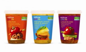
This effect is exactly what Pearlfisher was aiming to achieve when it was began work on designing Waitrose’s new health range Love Life. According to Foley, the design of the range educates consumers by showing them the exact ingredients in the products in an attractive way.
“The combinations of ingredients showcased through the food photography in Love Life also reflect great recipe combinations,” he explains. “Educating consumers about health does not have to be done in a dictatorial way that is all about saying ‘no’ or slimming fast, as was the previous norm. Health now needs to be about choice, taste and finding what is right for you.
“As well as Love Life, you can see this new approach to designing health in brands like Froosh and the Food Doctor, which is a great example of a brand that has understood the need to move away from its previous dictatorial packaging aesthetic.”
Downsizing risk
In addition to better communication on pack, the introduction of new packaging structures also has an important role to play in helping consumers make healthy choices, particularly when it comes to delivering smaller portions. However, this is an approach that needs to be handled with extreme care, says PRS’s Schurtz.
“Portion downsizing has tremendous risk because many sceptical consumers will believe profits and greed are the underlying reasons for smaller portions – sustaining an existing price – rather than executing this as a corporate gesture of nutritional responsibility,” he explains.
One trick to get around this issue is to put markings on packs, indicating how much consumers should eat per serving. This is a technique that’s been used by the juice industry for years. More recently Heinz successfully employed this approach for its innovative Beanz fridge packs.
The material used can also make a difference, according to a packaging source at one of the UK’s largest high street grocery chains. “You can control choices through the structure of a pack and the type of material that it’s made from,” says the source. “For example, you probably wouldn’t want to put a healthy product in an aluminium can with a ring pull because that sort of packaging is typically associated with sugary drinks. Likewise, you wouldn’t want to use too much flow wrap because that’s generally associated with chocolate bars or sweets, but you would want to use more paper-based packaging to signify to people that the product is a bit more natural and homemade.”
In addition to devoting more care and attention to the sorts of packaging materials, structures and imagery used by brands in the future, experts anticipate that increasing numbers of brands looking to position their products as ‘healthier options’ will place a greater emphasis on technological tricks and gizmos to reinforce the messages printed on pack.
“I see there being more interactive packaging on the way, interacting with your tablet or smart phone,” says Ian Schofield, head of innovation at Sun Branding Solutions. “You could be given healthy recipes to cook from using QR codes and links to websites. Packaging could tell you what would be a good accompaniment or drink to have with your food choice to keep it healthy, so you can ship it there and then or click and collect. The options are endless and it really is an exciting time for the future of packaging.”
Whatever the future holds, it’s clear that action needs to be taken soon if the country is to combat the obesity threat. A crunch meeting between industry groups, including the Food and Drink Federation and the government, will be held early in 2013 to hammer out the details of the front-of-pack labelling system.
But even when these new labelling measures are introduced they may on their own not be enough to encourage healthy eating. As research published in November by research group Him! discovered, almost 30% of shoppers don’t look at labels when buying food and drink. And those that do bother to read the labels may not be dissuaded from purchasing a product regardless of the warning signs on pack.
Sceptics point to tobacco and the proposed introduction of so-called plain packaging. As a source at another retailer puts it: “You can tell people something is unhealthy, you can write messages all over the pack, print traffic lights and use a material associated with healthy products. But ultimately, if they really want the product, they’re going to buy it.”
Vox Pop
If packaging can push people to make healthy choices, then can it also lead them to unhealthy products?
Claire Richardson
Product manager, Little Dish
Absolutely. At Little Dish we strive to help mums make healthy choices every day for their children and this is communicated through details in our packaging, such as the use of muted and textured colours, matt varnish and a story-book look. Glossy packaging and bright, bold colours can be very appealing, particularly in today’s crowded market. These packaging traits are often used by traditionally unhealthy brands to appeal to adults and children alike. At Little Dish we see our packaging as an extension of our brand and our products so we design accordingly. We have games and activities printed inside all our meals for one to five year-olds and have added an element of fantasy and adventure to our new fresh filled pasta products for kids up to seven years old.
Stergios Bititsios
Associate director of packaging and design, MMR Research Worldwide
Packaging, through its structure and artwork, can influence consumer choice in any direction a brand wishes to take. There is no doubt that brands could utilise the power of packaging to allure consumers to unhealthy choices. It is hard to believe though that this forms part of global brand strategies as much as it is impossible to accept that consumers lack critical thinking. We know that manufacturers have an obligation to protect and enhance the image of their brands and consumers have a responsibility to make the right choices for themselves. We see both these realities in the course of all the packaging research that we carry out in every market, every week.
Claire Farrand
Public health nutritionist and international programme lead, World Action on Salt and Health
In the UK, food manufacturers have been gradually reducing the amount of salt added to food products by 20% to 50% over the last 10 years; most of these reductions have been made without consumers even noticing, yet we have all been enjoying the health benefits. Food labels and health claims aim to assist us in making healthier choices; however, not everybody is able or willing to make that healthy choice. It is vital that food manufacturers continue to improve the nutritional profile of their products, by reducing the amount of salt, sugar and saturated fat they put in them. It’s not what is on the pack that is going to make the nation healthier, it’s what’s inside that counts.
Bernie Butler
Managing director, Good4U
It is regrettable that many companies use packaging design and messaging in a way that misleads the consumer, especially children, by motivating them to purchase a product that may have a negative impact on their health. However, as consumers and government agencies demand more transparency and honesty this practice will be challenged. When considering packaging options, Good4U have criteria which reflect the brand credentials and product integrity while always communicating a message of health. Core elements include the Good4U logo, bright colours, convenient packaging with clear nutrition claims.

