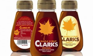
LBD creates new look for Clarks maple syrup
Leahy Brand Design (LBD) has created a new look for maple syrup brand Clarks
The newly designed packaging was launched in Asda over Christmas, with further listings in Tesco, Morrisons and Sainsbury’s.
 According to LBD, Clarks is the brand leader for maple syrup products in the UK.
Tim Leahy, managing director of LBD, said the firm helped the brand to “tell the story of Clark’s syrups” by “educating consumers to the possibility of their many uses”.
Leahy explained: “The challenge of the project was twofold; to connect consumers with the Clarks brand in the whole world of syrups with a strategic review of the brand and creation of a competitive positioning, followed by the redesign of their core Maple Syrup range.
“It was clear to us that there was an opportunity to tell the story of the Clarks syrups, educating consumers to the possibility of their many uses; from pancakes to gammon and ice cream to salmon and encouraging new usage occasions and experimentation.
“We created a ‘Clarks It!’ poem as a rallying cry for the brand to do more with syrup and this in turn influenced our bold and playful maple leaf ‘splat’ as a distinctive, simple and own-able brandmark. The brandmark and packaging design is designed to show consumers that maple syrup is fun, not just for pancake day, encouraging the whole family to experiment and ‘have a go’.”


